The Role of Decisiveness in Ink
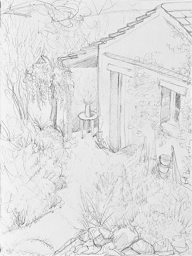
Working with ink is a practice of commitment. Once the ink touches the paper, there is no taking it back. Every mark carries weight. Each decision leaves a trace that cannot be undone, demanding presence and acceptance. The unchangeable nature of this medium transforms the creative process into a dialogue with consequence: every choice becomes part of the story, and even “mistakes” invite new paths, unexpected connections, and hidden possibilities.
The painting builds itself stroke by stroke, layer by layer, each step both irreversible and full of potentiall. It is in making peace with what cannot be changed, and finding inspiration within it, that the work takes shape, often leading to solutions and expressions that could never have been planned.
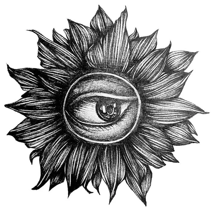
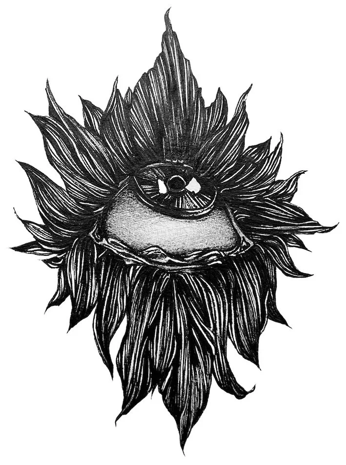
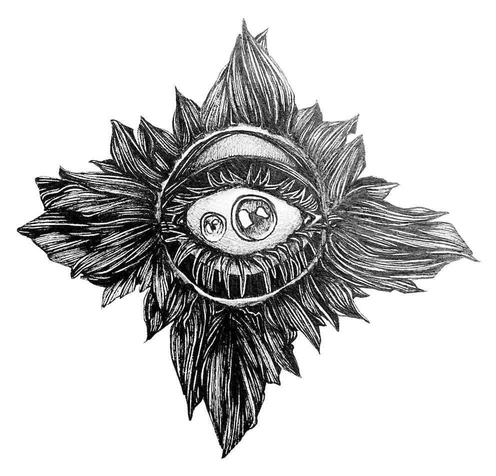
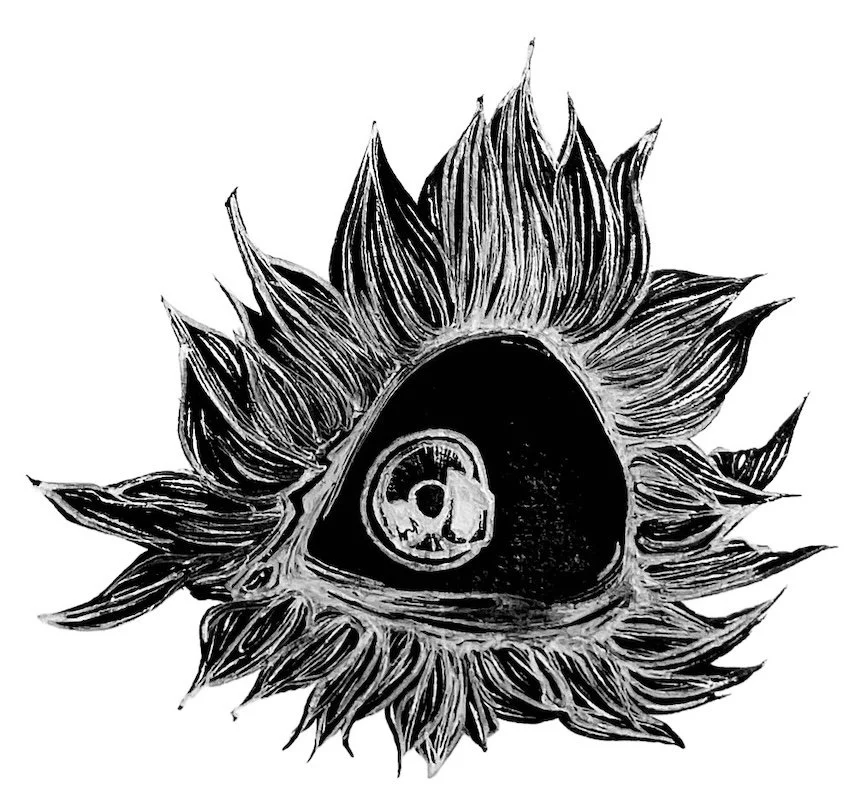
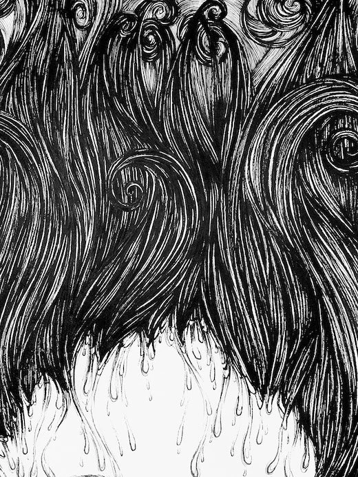
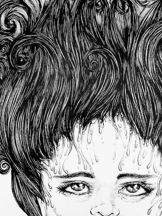
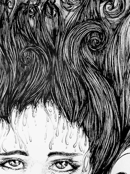
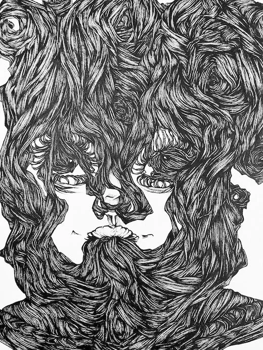
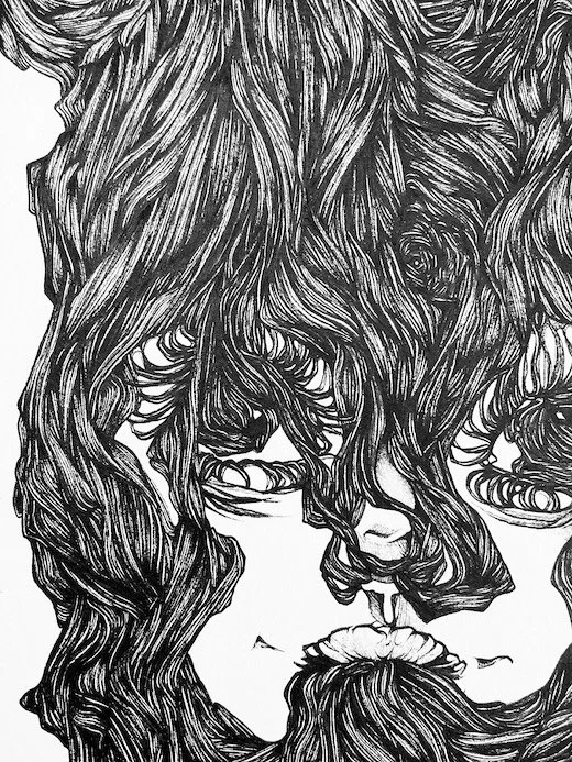
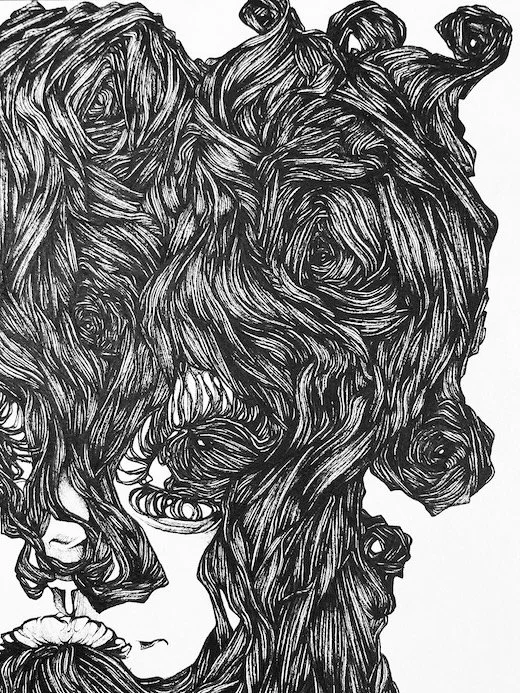
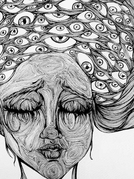
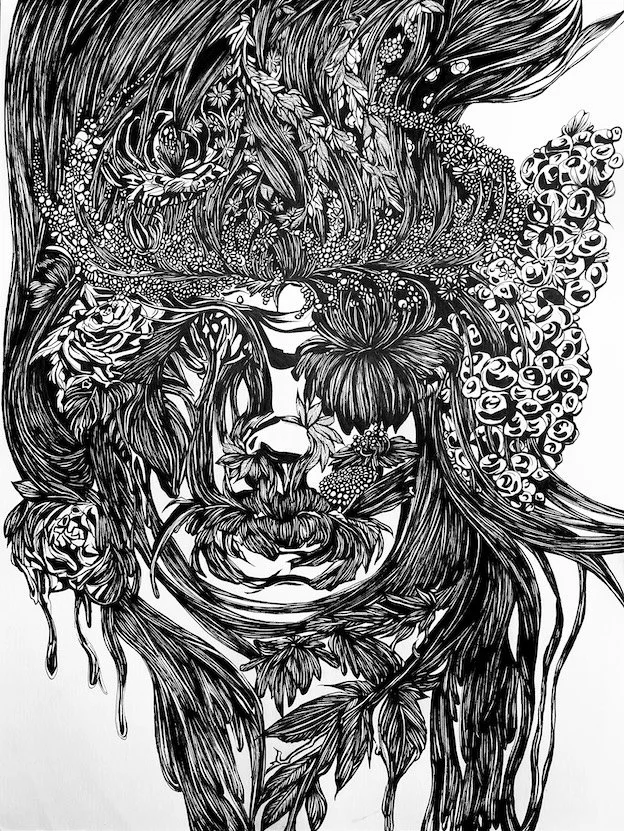
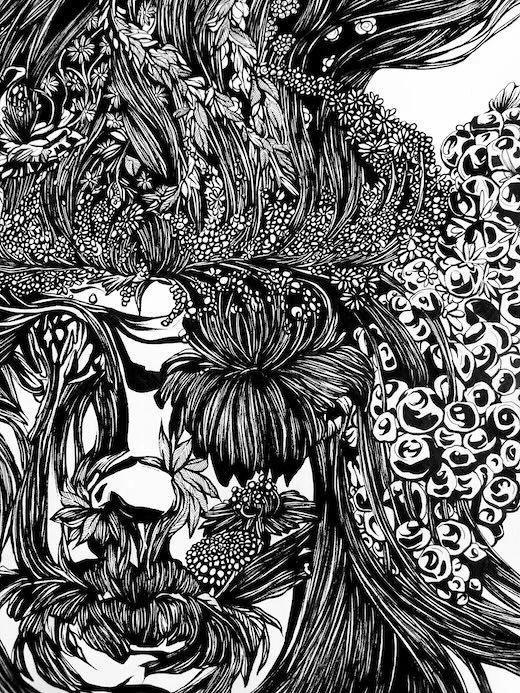
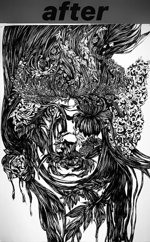
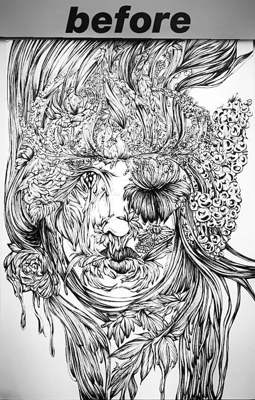
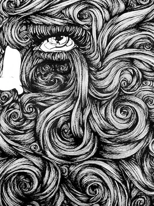
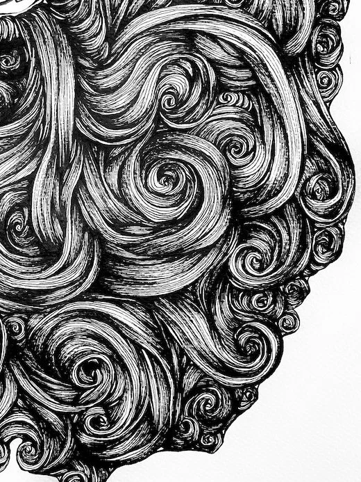
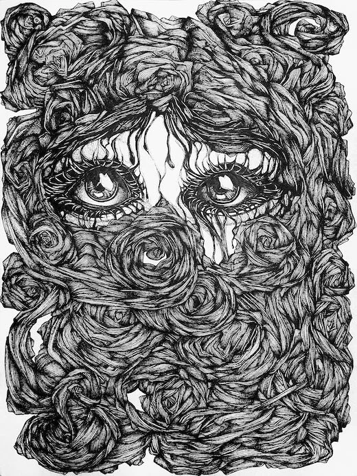
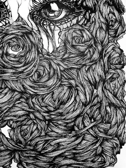
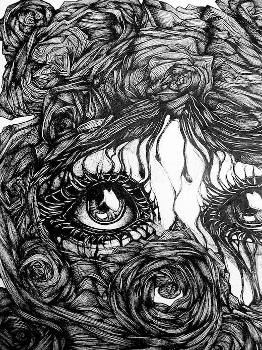
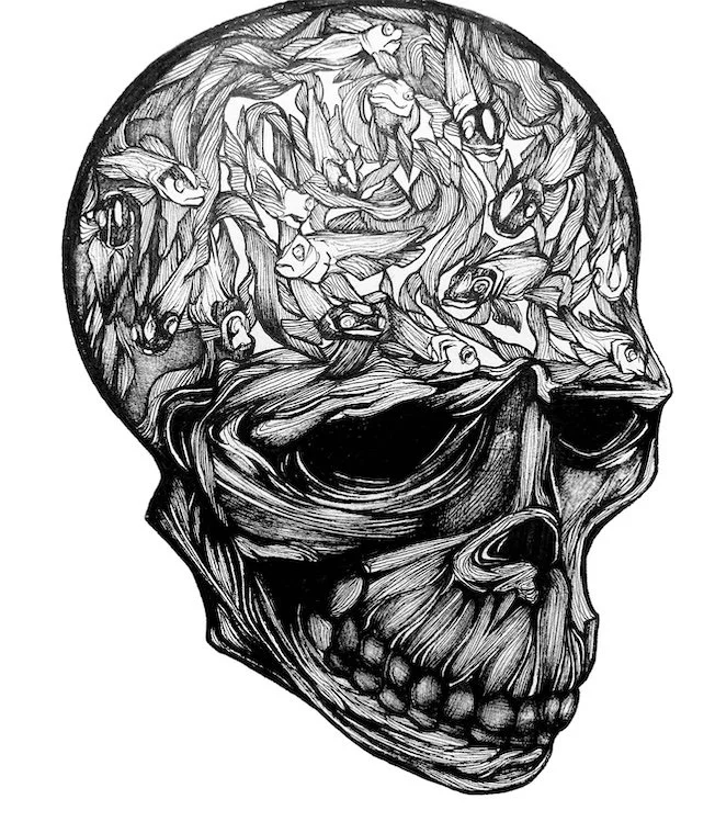
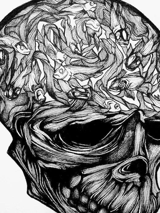
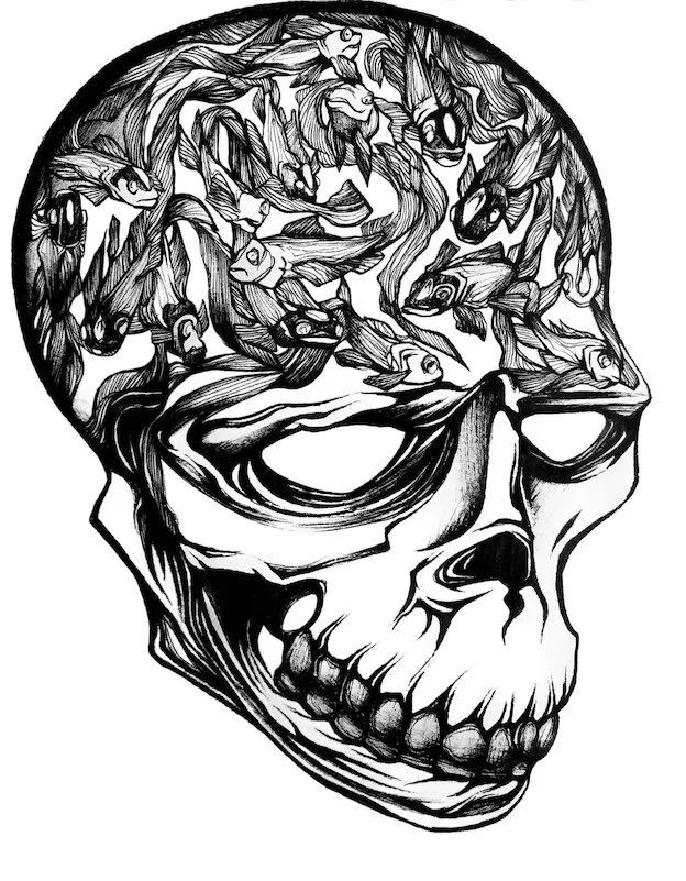
Black Ink.
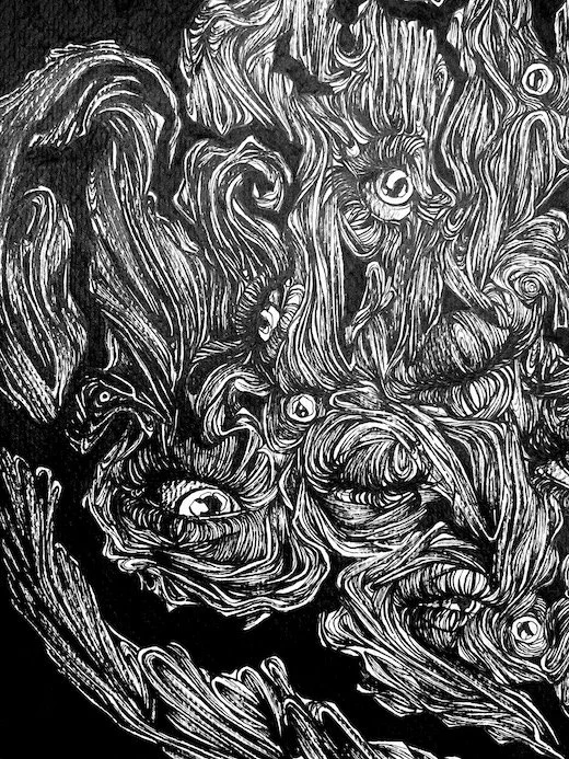
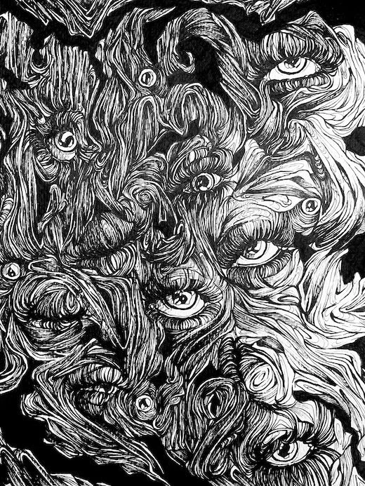
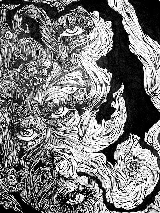
I love the sharp contrast between black ink and white paper, the way a single stroke can define space with precision and control. It has always carried a sense of order for me, steady, deliberate, timeless. Beyond that, black is of course the traditional color of ink and in ancient China it shaped entire worlds of art and writing. That heritage has stayed with me, not as nostalgia but as a quiet respect for the medium itself. For all the ways I experiment, there is something grounding in returning to black, a reminder of where ink as an art form began and how it continues to hold everything together.
Red Ink.
Red ink has a special place in my heart. It marks the moment I chose my own path, when I spontaneously decided at my first tattoo appointment to go with red instead of black. It wasn’t planned, just an emotional decision, and those have always served me best. Piece by piece, my skin turned into its own artwork, a steady companion reminding me of who I am and the red color became a personal reminder to stay true to myself and not bend to norms that don’t fit. The red thread guiding through my life is quite literally red.
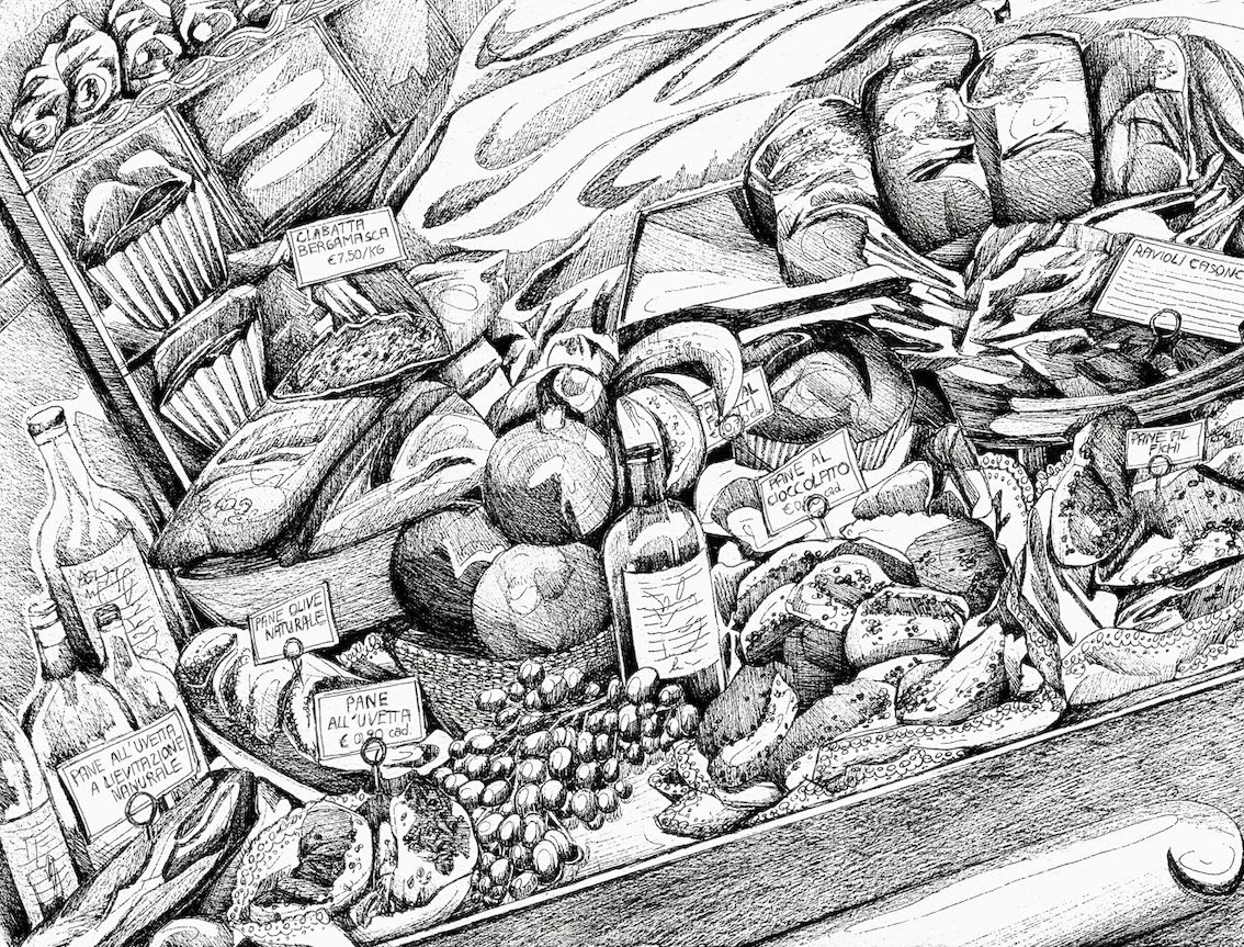
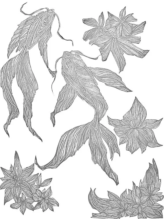
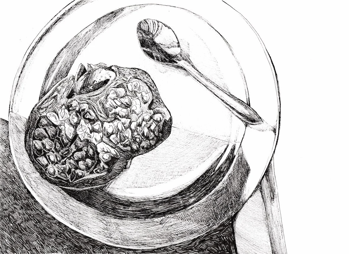
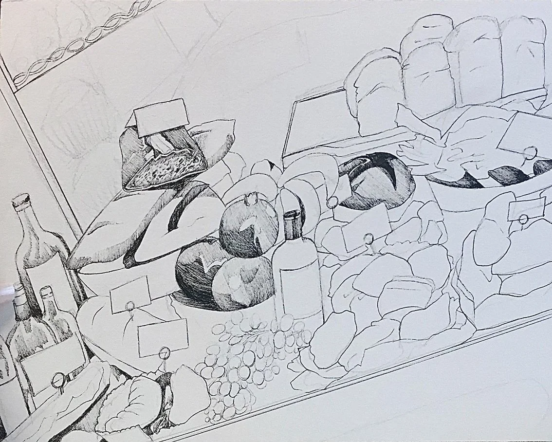
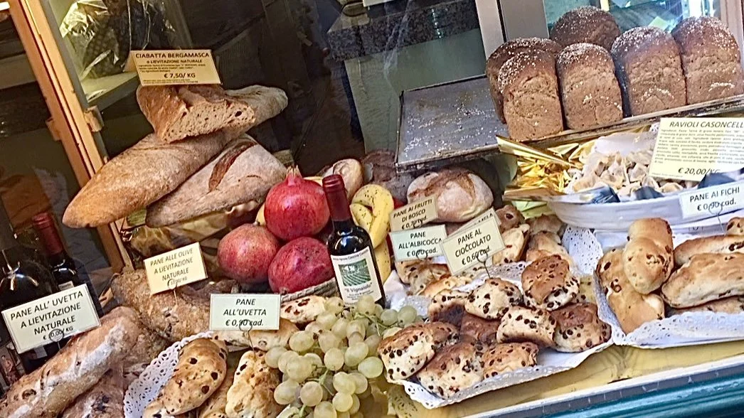
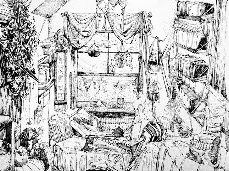
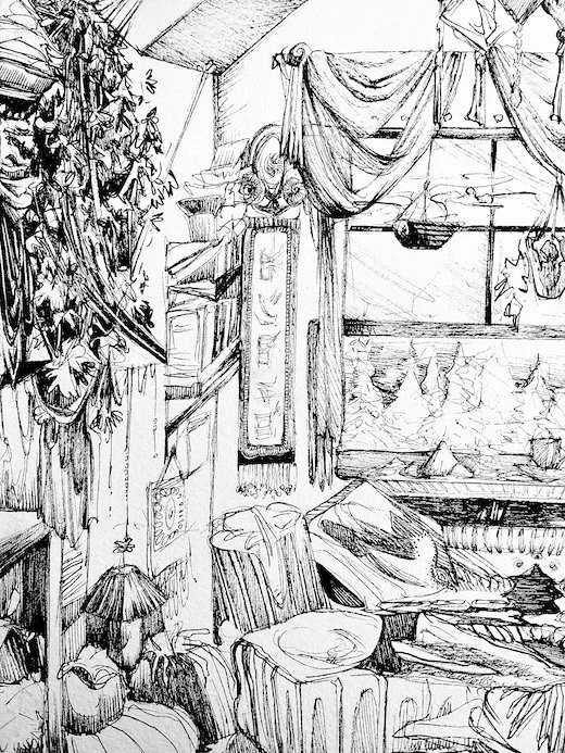
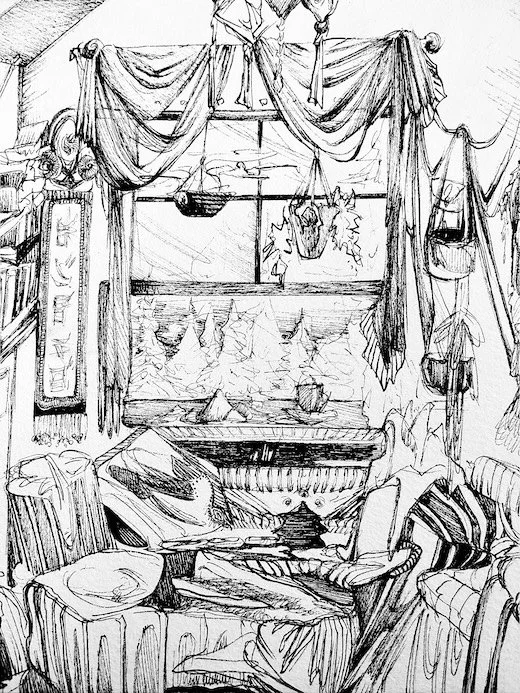
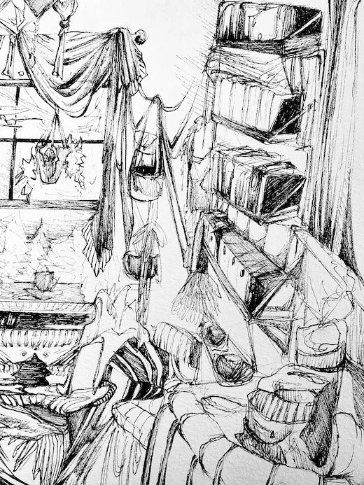
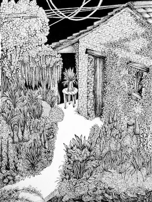
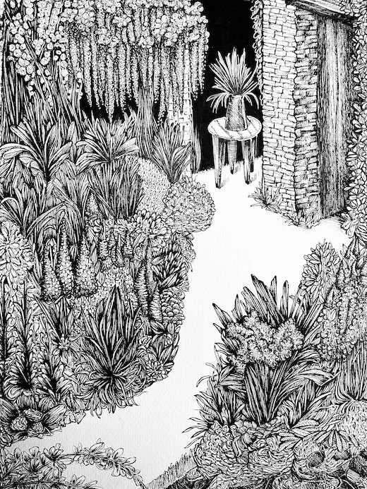
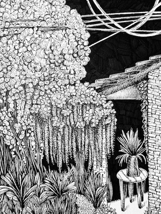
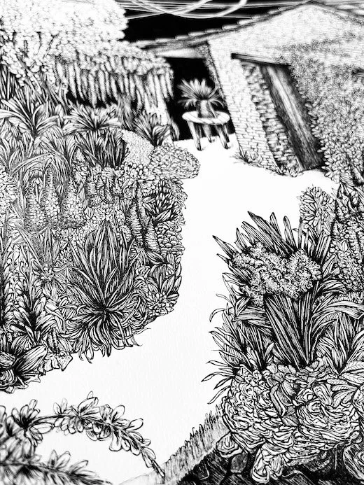
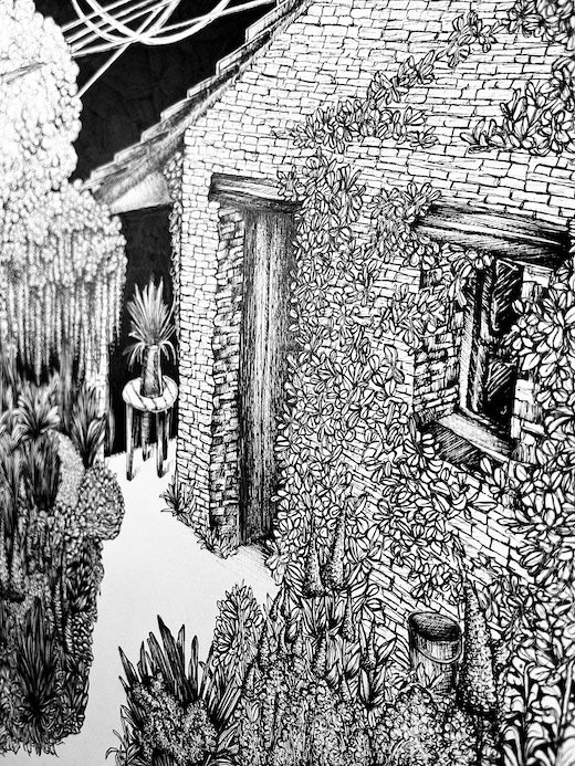
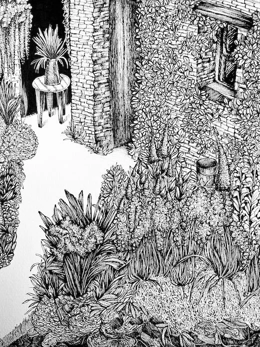
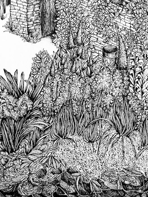
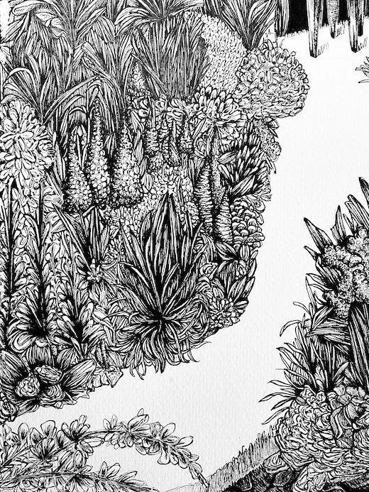
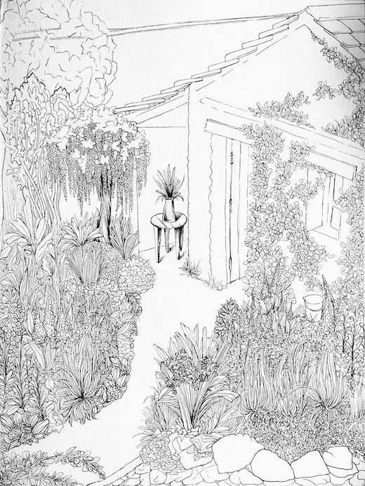
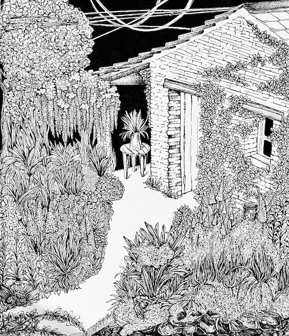
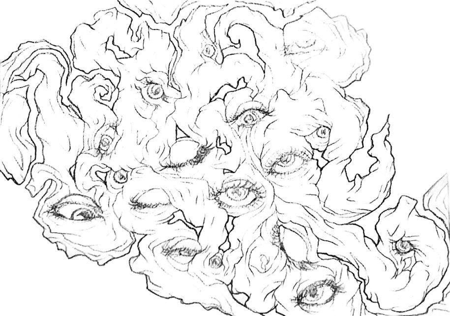
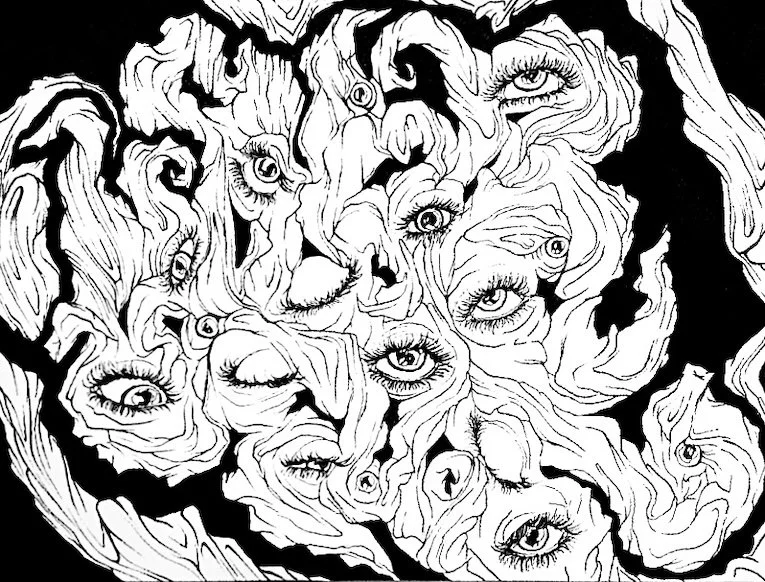
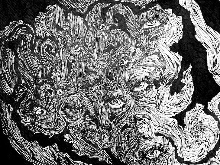
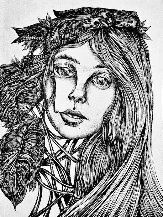
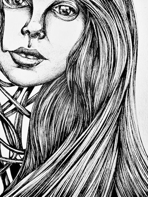
Black Ink.
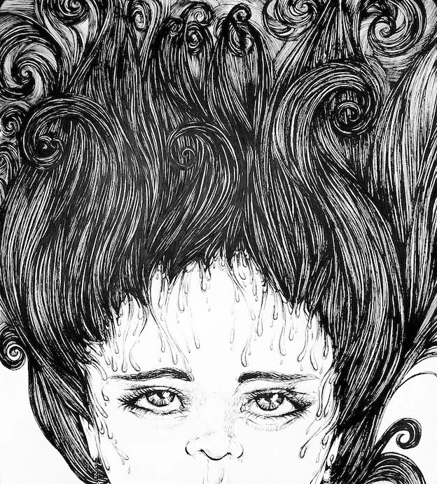
When illustrating landscapes, still lifes, or drawing from observation, black naturally became the most fitting color. Building up layers of depth while keeping each stroke direct and straightforward lets me highlight exactly what draws my attention. The clarity of black lines on paper is fast, effective, and honest. It's a way to capture form and detail without distraction, focusing purely on what I see and how I choose to frame it.
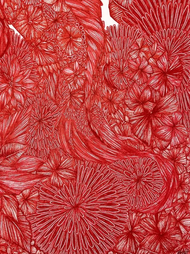
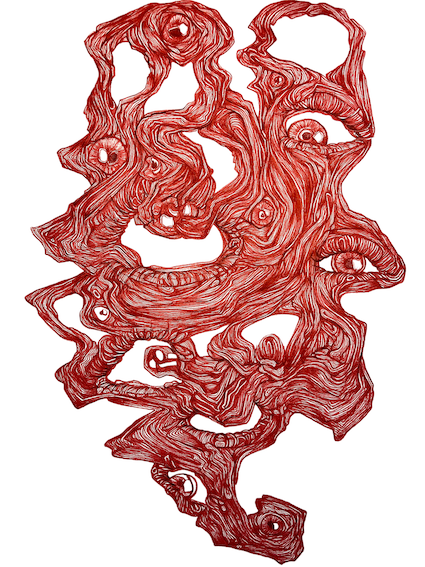
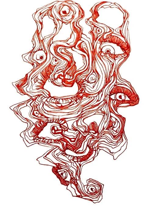
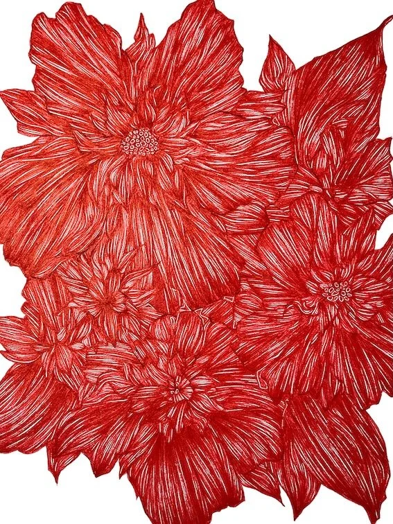
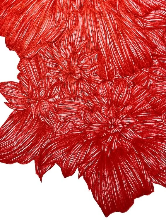
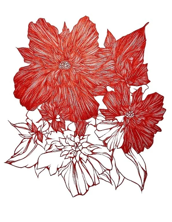
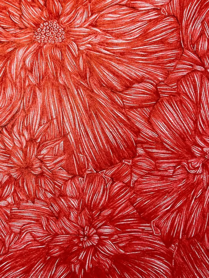
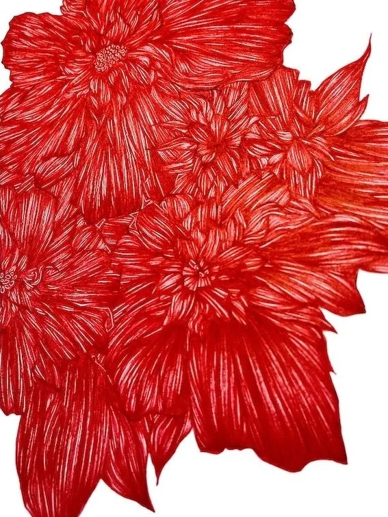
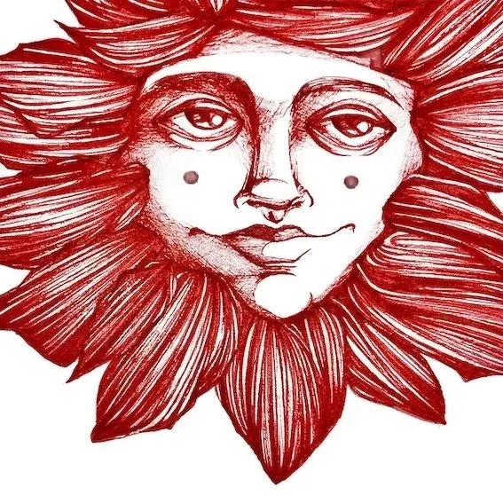
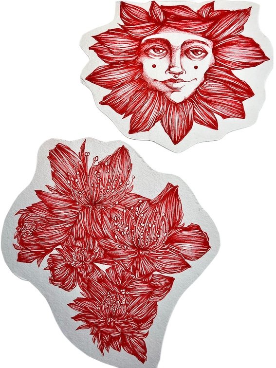
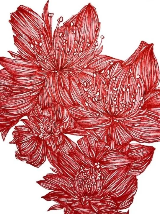
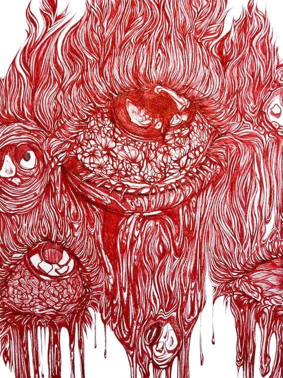
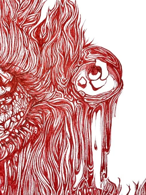
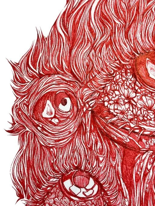
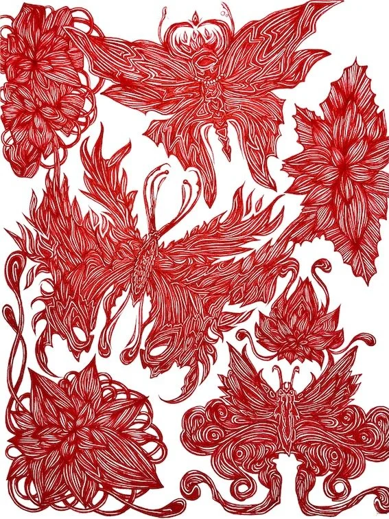
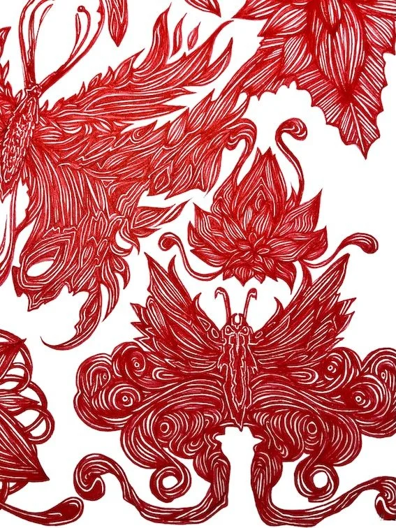
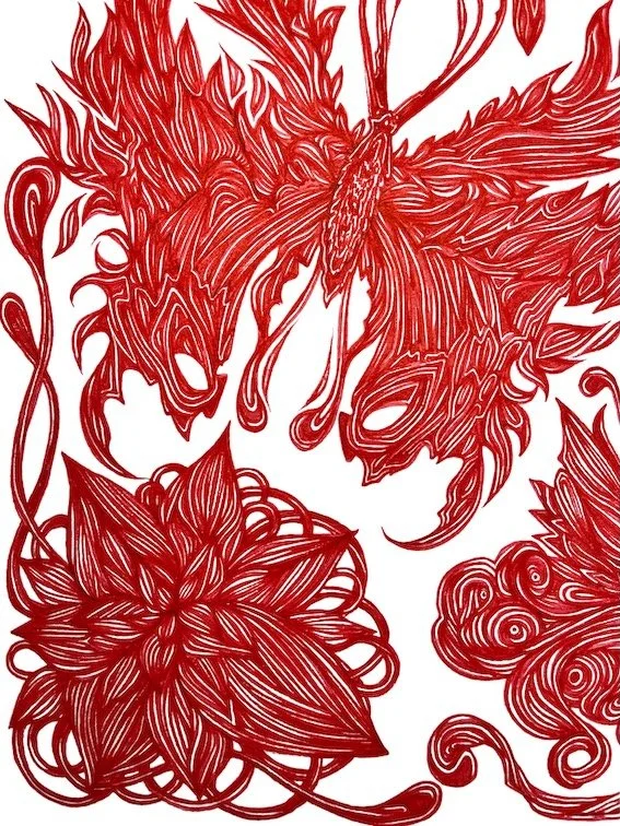
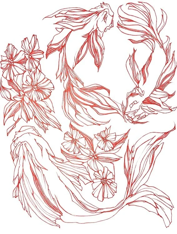
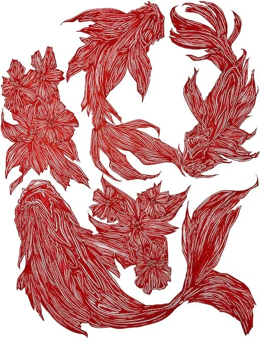
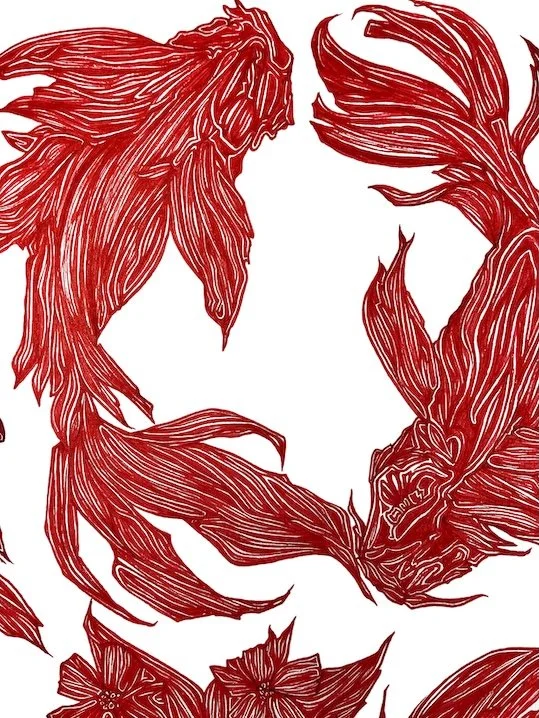
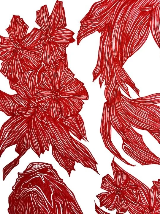
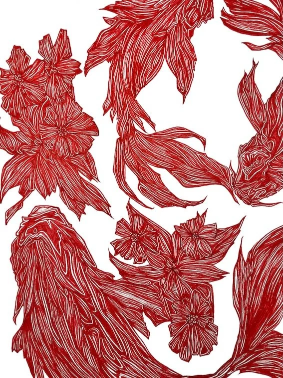
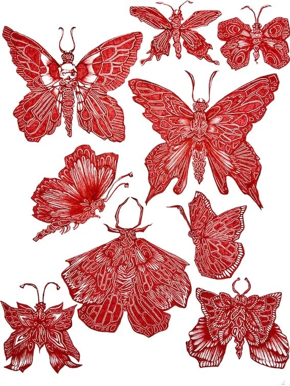
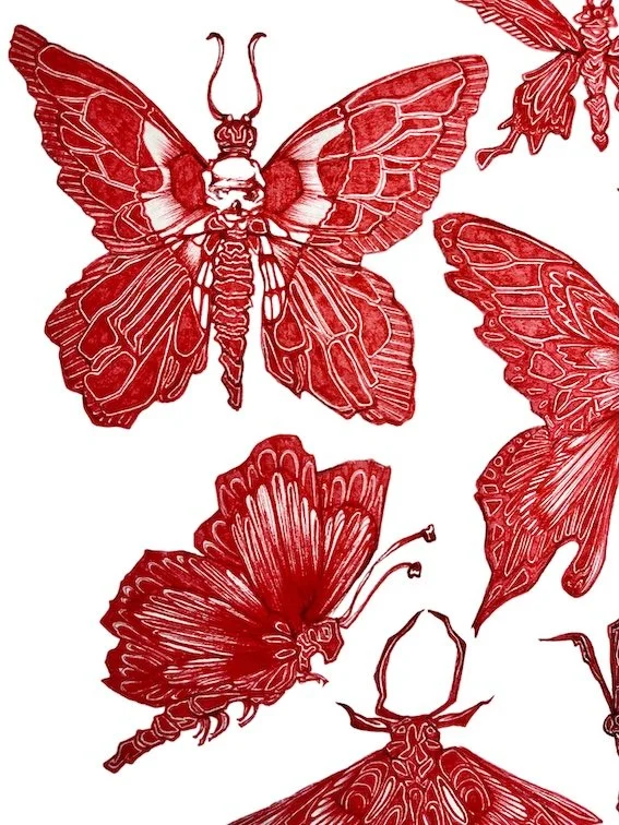
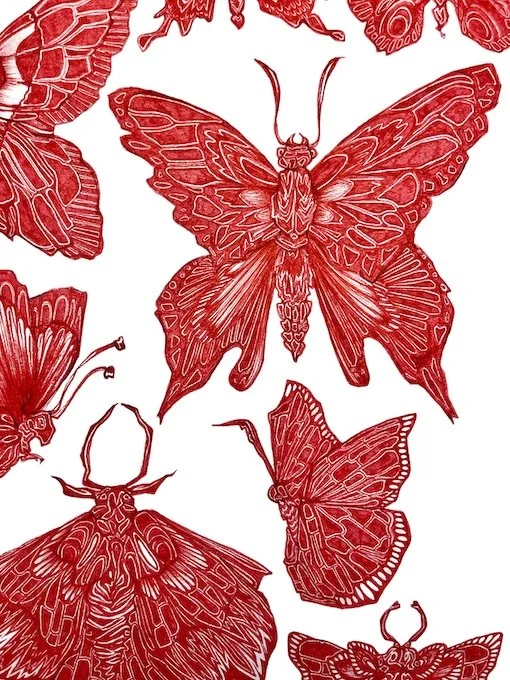
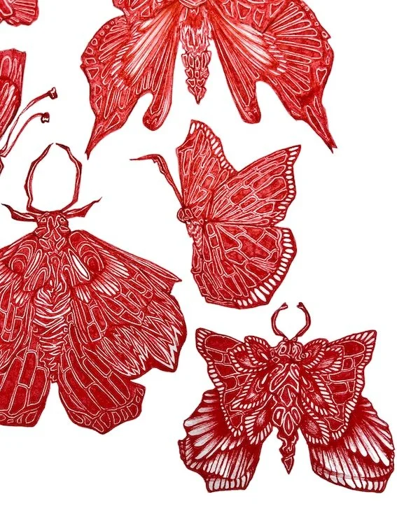
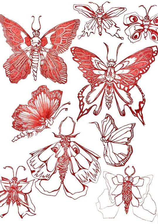
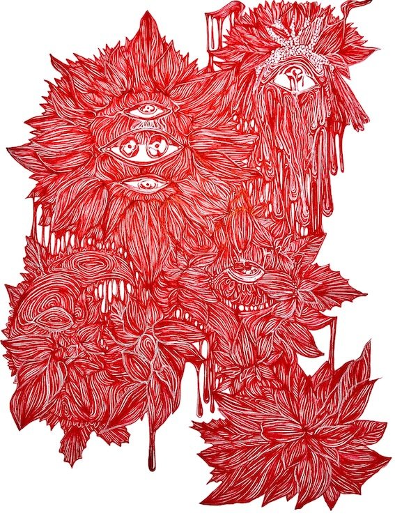
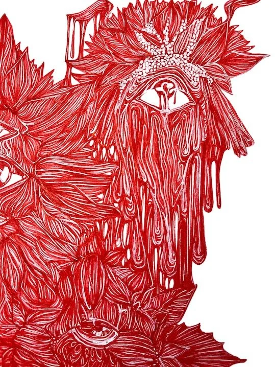
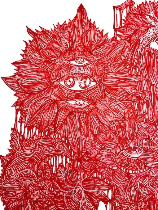
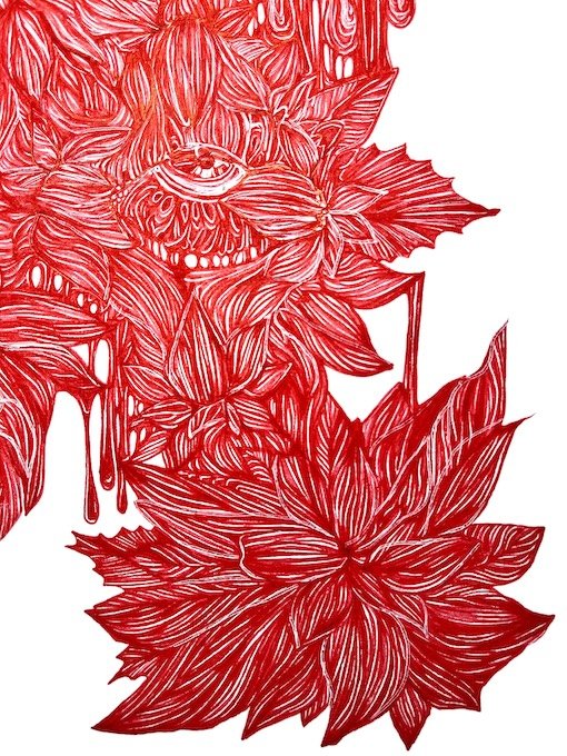
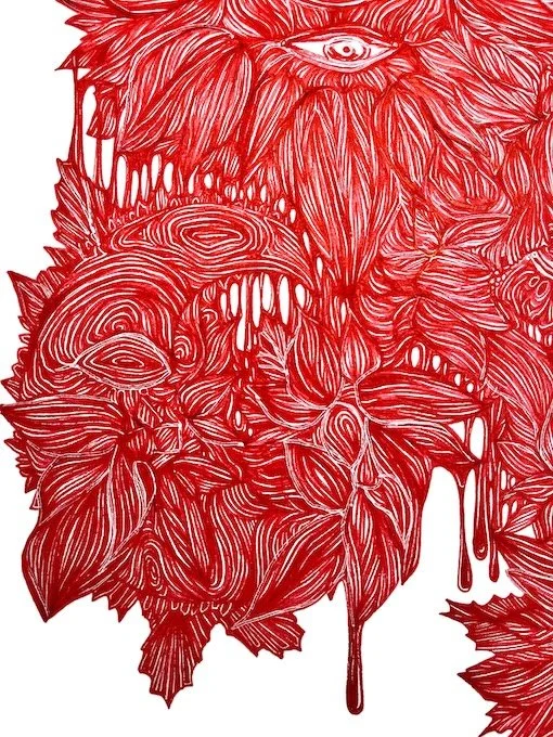
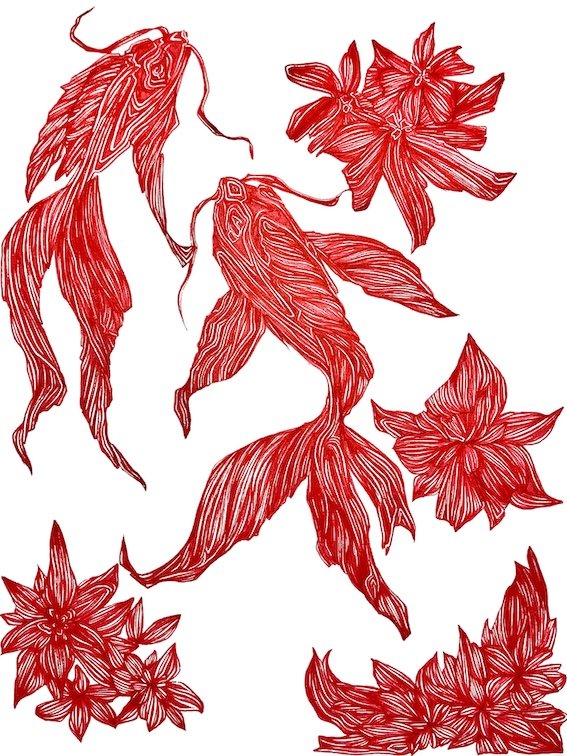
Red Ink.
I work with red ink in my projects when creating tattoo art, hand-drawn illustrations, and custom designs. Its vivid tone makes details stand out, but it also carries a deep emotional value for me. Red reflects intensity, passion, and a certain raw honesty. It’s a color that gives my pieces both strength and a subtle idea of what’s inside me.